Thursday, April 30, 2009
Business Card designs for "Creative Mamas" congo
I created three different business card designs to match our new congo design. I think they turned out rather nicely! I really enjoy working on so many different types of graphics projects. :)


Labels:
business card,
custom,
designs,
hyena cart,
Joyful Rose,
JoyfulRose
Wednesday, April 29, 2009
Samples for "Sweet Retreat" congo - Part III
Final Samples for "Sweet Retreat" congo. :) Heather asked for a flowered background to match the top two headers. The top background is larger than the second; both can be scaled smaller and the background color changed.
She also sent a final image to test out for the header. I tried stretching the image to fill the whole header and it was very pixelated. Then I tried copying part of the image and pasting it several times to create a continuing background, but it looked like a kaleidoscope - lol! Then I thought it might look nice as a "scrapbook"-type header and that seemed to work perfectly.
Tina :)

Labels:
congo,
custom,
designs,
hyena cart,
Joyful Rose,
JoyfulRose,
sweet retreat
Tuesday, April 28, 2009
Samples for "Sweet Retreat" congo - Part II
Here are the last set of samples for the "Sweet Retreat" congo. :) Heather asked for a bit of decoration on the brown background and to change the font for the header. I purchased the image of the spa lady and replaced the Fotosearch image. Took the leaves out of the main image, added some special effects, and placed them on the brown background; I think it looks rather nice!
Heather also requested another sample using the image she emailed of the feet in the tub with the flowers. I tried a few different header ideas (the one with the main image to the far left is the original image) and created a couple of backgrounds to match the stone floor motif.
Table and background colors can all be changed. :)

Labels:
congo,
customs,
designs,
Joyful Rose,
JoyfulRose,
sweet retreat
Monday, April 27, 2009
"Sweet Retreat" Congo Samples
This Congo was looking for a "relaxing, spa kind of feeling". They provided me with the main image of the spa girl and I designed the congo's theme around those colors.
*Don't worry, as soon as the design is chosen I'll purchase the image from Fotosearch and the watermark will no longer appear across the girl. :)
Note: click on the image below to enlarge.

*Don't worry, as soon as the design is chosen I'll purchase the image from Fotosearch and the watermark will no longer appear across the girl. :)
Note: click on the image below to enlarge.

Labels:
congo,
designs,
hyena cart,
JoyfulRose,
spa,
sweet retreat
Wednesday, April 22, 2009
Samples for "Zany Zebra Designs" - Take 2
Samples for "Zany Zebra Designs"
Amy Sue was looking for a header that incorporated her main site design, but something a little bit different and fun. :)
Here are some sample headers. I created them the same size as her original HC header so that she wouldn't have to change any of her coding (note: the samples are shown smaller than actual size). All can be saved as .gif or .png files. The 4th sample has a transparent background where the zebra stripes are so that the actual background will be seen behind the image.
Let me know what you think!

Monday, April 20, 2009
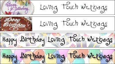
Samples for "Loving Touch Wetbags" Animated Banner
Tuesday, April 7, 2009
Otter Babies Samples Take 2 :)
Monday, April 6, 2009
Samples for Otter Babies
Debby wanted her Hyena Cart to match her regular website, but was interested in seeing how it would look if we incorporated her darling little seal logo in other parts of the design.
First sample is the regular HC that matches her website, second incorporates little seals in the background, and third has a few more bigger seals in the background.
Hope you like these Debby! :)

First sample is the regular HC that matches her website, second incorporates little seals in the background, and third has a few more bigger seals in the background.
Hope you like these Debby! :)

Samples for Dreamseeds Organics
Kristena wanted a design with a blue background, stars, a moon rising over a mountain, and a little grouping of flowers on the mountain.
I've had a wonderful time working with Kristena and learning about the different types of herbs, soaps, lotions, salves, oil essences, etc., that can be used for healing!
Hope you like these samples. :)

I've had a wonderful time working with Kristena and learning about the different types of herbs, soaps, lotions, salves, oil essences, etc., that can be used for healing!
Hope you like these samples. :)

Saturday, April 4, 2009
JoyfulRose Header Designs
Examples of Past Header Designs. These are made to your specifications. :)
Basic Header Designs - $15
These are made with your choice of font and image(s) provided by you.
(Click on the image to view larger)

Basic Header Designs - $25
These are made with your choice of font and image(s) created or purchased by JoyfulRose.
(Click on the image to view larger)

Basic Header Designs - $15
These are made with your choice of font and image(s) provided by you.
(Click on the image to view larger)

Basic Header Designs - $25
These are made with your choice of font and image(s) created or purchased by JoyfulRose.
(Click on the image to view larger)

Labels:
artfire,
designs,
etsy,
headers,
hyena cart,
Joyful Rose,
JoyfulRose
Thursday, April 2, 2009
Earth Day Banner for Creative Mamas
Here are a couple of banners I designed for our Earth Day stocking on April 22nd. Happy Earth Day!!!


Labels:
animated banner,
creative mamas,
earth day,
JoyfulRose
Wednesday, April 1, 2009
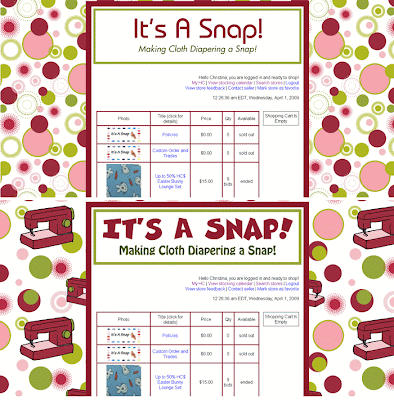
Samples for It's A Snap!
Subscribe to:
Posts
(Atom)
Blog Archive
-
▼
2009
(194)
-
▼
April
(15)
- Business Card designs for "Creative Mamas" congo
- Samples for "Sweet Retreat" congo - Part III
- Samples for "Sweet Retreat" congo - Part II
- "Sweet Retreat" Congo Samples
- Samples for "Zany Zebra Designs" - Take 2
- Samples for "Zany Zebra Designs"
- Samples for "Loving Touch Wetbags" Animated Banner...
- Samples for "Loving Touch Wetbags" Animated Banner...
- Samples for "Loving Touch Wetbags" Animated Banner
- Otter Babies Samples Take 2 :)
- Samples for Otter Babies
- Samples for Dreamseeds Organics
- JoyfulRose Header Designs
- Earth Day Banner for Creative Mamas
- Samples for It's A Snap!
-
▼
April
(15)


